The Changing Face of Our Aquarium
This is the third installment of a four-part series on the many changes the Santa Monica Pier Aquarium has gone through since March 1, 2003, when Heal the Bay took over management and ownership of the marine education center. Today’s blogger, Aquarium Director Vicki Wawerchak, recounts some of the not-so subtle modifications.
The exterior and interior of the facility has undergone a variety of design and color changes in the past nine years. When I first arrived at the Aquarium, it was decked out in traditional UCLA blue and gold. And growing up with a father whose mantra was “Root for UCLA and anyone playing against USC!” – I didn’t mind seeing those colors that had surrounded me for many years.
But after settling in and infusing Heal the Bay’s mission into everything we did, we decided to create an exterior that not only called attention to the facility, but also used that space to educate. We designed a variety of concepts and color schemes for exterior paint, patio banners, sail fin banners and pole flags and decided to use the patio banners to educate the general public about the scale of the marine life in the Santa Monica Bay.
That same father who rooted for UCLA at the 50-yard line was also a teacher who taught me to look for and leverage every teachable moment available—even the ones that didn’t seem obvious at first. So I was excited about the educational banner idea and the staff were eager to debut this new addition. Never did I think it would backfire quite like it did. Many people saw the outline of a juvenile grey whale at 15 feet and a sea lion at six feet and were disappointed to learn that we housed neither of those species in our 4,500-square-foot marine education center—there were even visitors that asked for their $2 entry fee to be refunded. Best laid plans…

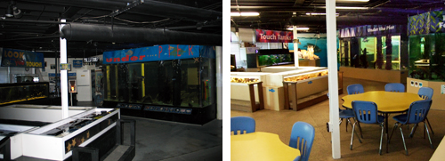
The interior of the facility has also been renovated numerous times; the original color scheme of black ceilings, black exhibit bases and grey floors was designed so visitors would feel they were stepping into an underwater world. The feeling of being under the sea was definitely infused into the facility, but again the opportunity to use the interior — not just the exhibits — as a teaching canvas was the driving force for the remodel. We painted the interior, worked to create new colorful exhibit banners, remodeled exhibit bases using recycled materials and installed a new sandy bottom-colored floor.
In December 2008, the installation of a carpet made of recycled material and flooring from recycled tires in our classroom added a new, fresh and clean look for the interior. That year, when we reopened after the holidays with the new design, the general public, teachers and students complimented the interior and a number visitors asked if we had expanded.
While we haven’t expanded our footprint, through creative use of every square inch of the Aquarium, we have managed to expand visitors’ knowledge of the local marine environment.
Read part two of the four part series.


