
Meet the local artist and illustrator behind our 2019 Coastal Cleanup Day poster, and get a glimpse of the process all the way from brainstorm to sketchbook to print. We love the final product and the journey it took to get here, thanks so much Aaron!
Give us some background on yourself and this project.
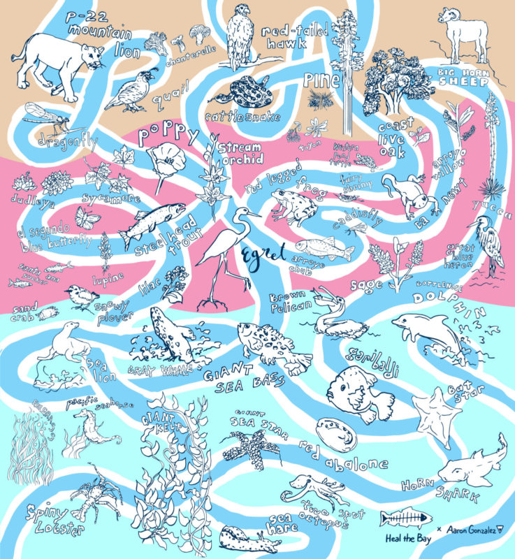
My name is Aaron Gonzalez and I’m a Los Angeles-based creative. The majority of my work is a stylized documentation of what’s going on around me, so my work naturally reflects L.A. It was a real honor to spend time drawing the variety of wildlife in L.A. County for this year’s Coastal Cleanup Day. My work tends to be a blend between representational and imaginative drawings, but this project leaned more on the representational side. Below is the final product.
What was your goal, inspiration, and process for creating this poster?
In addition to advertising Coastal Cleanup Day, the main goals of this poster were to highlight the local wildlife living throughout and watershed running through L.A. County. It was important to Heal the Bay and I to provide a visual aid explaining a watershed, since there is a lack of visuals on the topic. Watersheds keep L.A. County connected through waterways that flow from summit to sea. It’s extremely necessary we keep our waterways clean because it has a direct impacy on our water supply and the health of our natural environment.
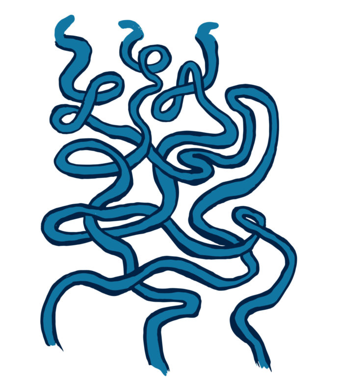
We decided to break the poster up into thirds to represent the mountain, river, and ocean regions. By including these three regions, we hoped to communicate how Coastal Cleanup Day doesn’t only have cleanup sites on the coast, but throughout L.A. County. I depicted L.A. County’s watersheds with a painting made up of loops flowing through the composition and ending where the poster text begins. I’ve always been a big fan of hidden messages within images, so I included “LA” within the waterways toward the top of the poster.


A collection of poster iterations we explored, before settling on the final version.
During the poster design process, I took a couple of trips to Heal the Bay Aquarium and spent some time with a few of the marine animals I was drawing. I also took a trip to visit my sister, who is studying wildlife biology at Humboldt State. She gave me insight on what to be mindful of when depicting animal and plant life. For example, how the wrong petal or leaf count can determine one plant species from another. Heal the Bay provided me with a hefty list of animal and plant species to include, along with their scientific names, so it made my job easier and the drawings more accurate. It was also super helpful to have in-house aquarists at Heal the Bay Aquarium and scientists at Heal the bay to double check the accuracy of each species.
What were some of your favorite parts of the process and things to illustrate?
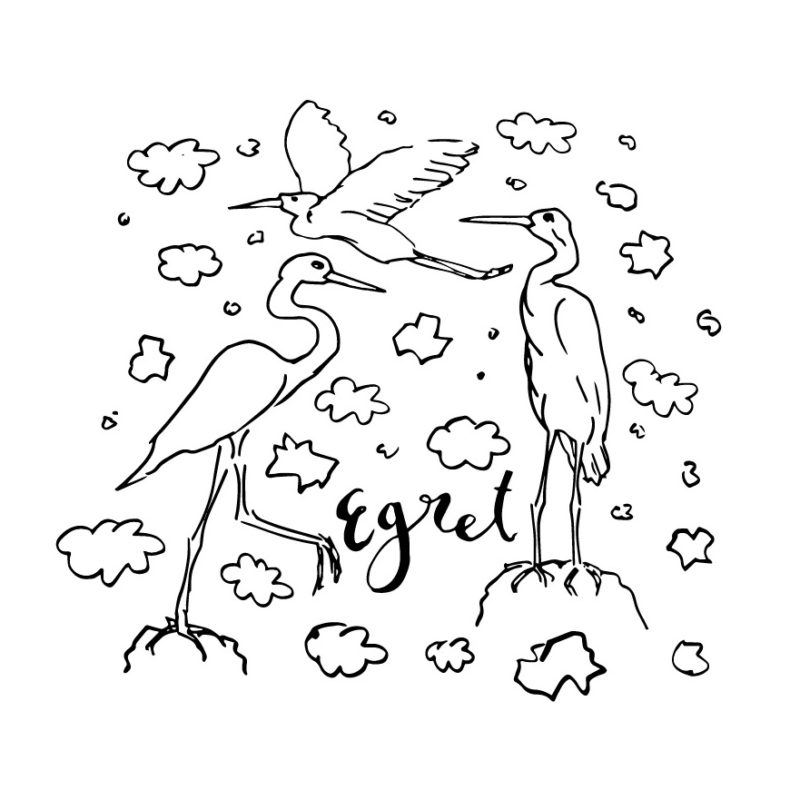
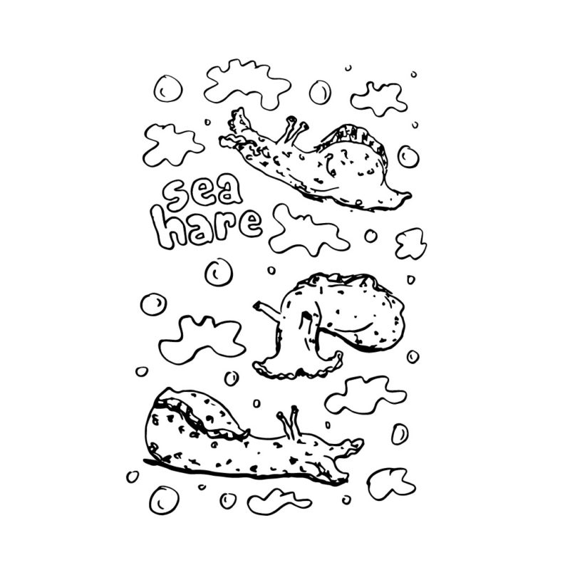
My favorite animal to illustrate was the egret. Not only is it iconic to L.A., but the physical features are super interesting. I like to draw wavy and wobbly lines, so drawing the egret’s elongated neck was really satisfying. I had to keep the consistency of drawing representational wildlife throughout the poster, but I kept thinking about the possibilities of drawing an egret with an extra long wobbly neck with twists and turns similar to the waterways in the background. One of the toughest animals to draw was the sea hare. For the longest time, I didn’t know what I was looking at. They look like deformed blobs with spots. It was one of those drawings where you didn’t know what you were making until it was done. I had to draw multiple sea hares, close my notebook, open it the next day with fresh eyes until I understood what they were. Now they’ve become some of my favorite drawings from the poster.
Another aspect of the project I was really excited about was the Korean lettering for the poster’s language variations. I am not familiar with Korean, so it felt like I was creating abstract shapes and developing a secret code. The challenge was to make the Korean text match the type style I was creating for the English and Spanish versions, maintain the consistency of each character’s height and width, and do my best to keep it legible. I managed to recognize a few patterns within the text by the end of it and I now look at signs in Koreatown a lot differently. I sent off what I came up with and was excited to hear it was approved by the Korean translator.
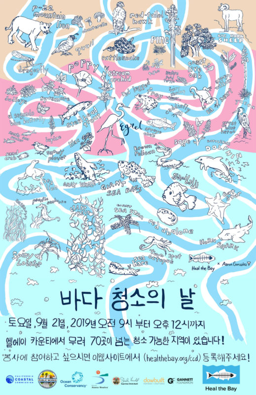
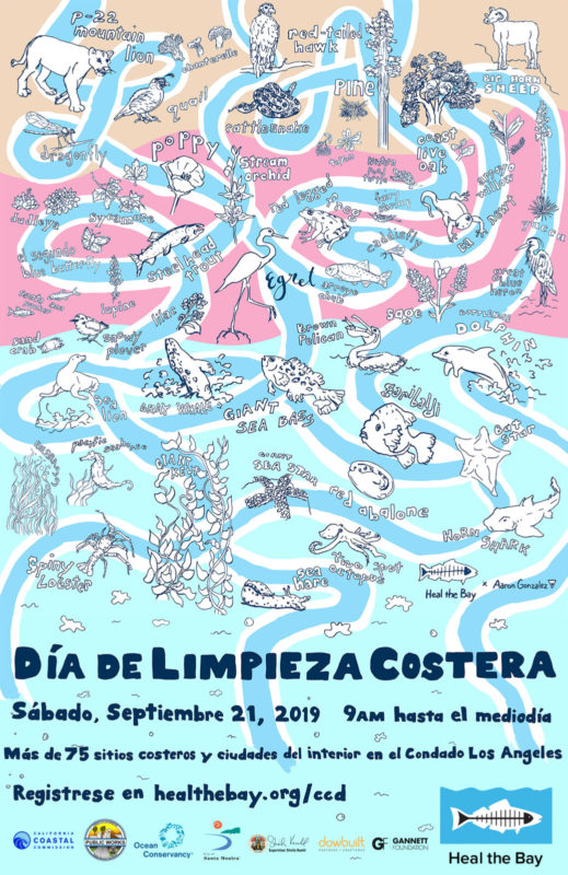
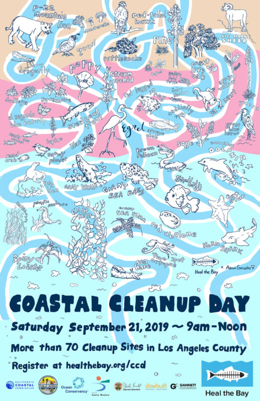
On top of the watershed, I sprinkled each wildlife species in their proper region. I keep imagining these drawings as textile adorning objects. Forming textile designs based on specific groups within a particular region would be great. For example, all of the plant life from the river and mountain regions living on a button down shirt or sundress. Or a collection of aquatic life forming a pattern on the interior of a beach bag. The possibilities are endless.
Overall, it was an amazing opportunity to design this year’s Coastal Cleanup Day poster. Heal the Bay is an incredible organization who has been amazing to work with from start to finish. Thank you for all that you do.
If you’re curious to see more of Aaron’s work, check out his website and Instagram.
To see more behind-the-scene sketches, see our Heal the Bay Instagram.